
I now have the ability to create summary histograms characterizing the workloads. These are (re)-generated as I update performance reports, but following is values with ~170 workloads added. Walking through the histograms and what they describe…
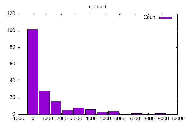
Most of the runs are fairly quick, though I have a few benchmarks that run up to several hours. This is the elapsed time that often runs the workload three times. I then run this benchmark ~6 times collecting various metrics.
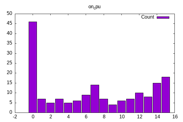
The distribution of worklods shows a small number of single-threaded workloads, a cluster around the number of cores w/o hyperthreading and then some that use as many cores as possible.
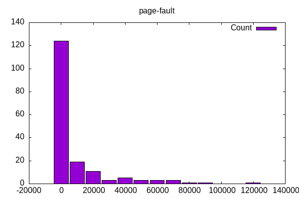
The number of page faults has a few outliers that are interesting for their own analysis: octave-benchmark, gimp, lulesh, openjpeg, tungsten… are these bringing file information into memory and operating on it? There is a similar story with context switches and stress-ng, wireguard, compress-rar which I assume are all more interrupt driven than CPU.
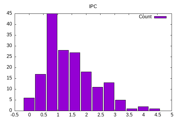
IPC shows a range that is lower than I expected but presumably some of these can’t take advantage as much of the core-bound aspects.
Similar picture for GHz which I calculate using the number of cycles divided by seconds. For some of those on the low end, it is similar to stream – waiting on memory traffic or similar reason? I assume for some others we have power limitations. Given how dynamic power is, assume the combination of IPC and GHz are more important – perhaps try an X/Y scatter plot with both variables?

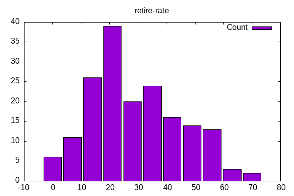
Retirement rate as a percent of available slots shows more of a bell curve
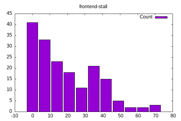
Frontend stalls have a diminishing relation where those at the high end might be a subset to dive deeper
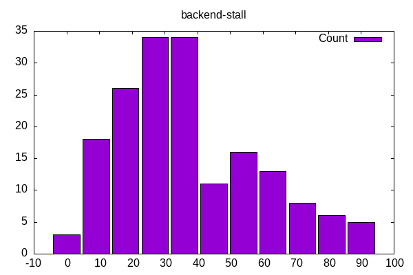
Backend stalls are more of a bell curve with a minimal amount for any of them and a small subset with a very high percentage
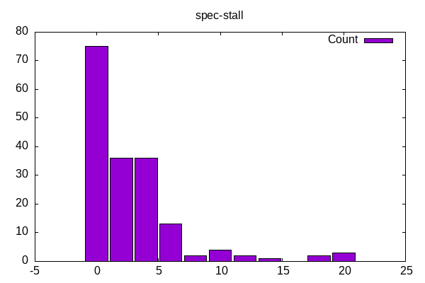
Speculative stalls are low for most workloads with a small number of outliers
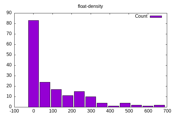
Float density has up to have the code with little floating point and the rest on a distribution
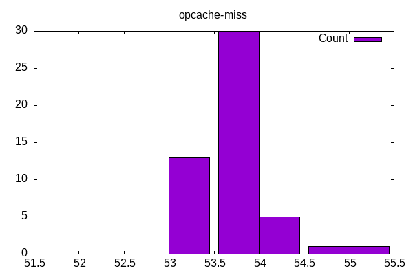
Both the opcache and the i-cache miss rates surprise me mostly on how narrow the range of miss-rates are at. Seems like this doesn’t contribute by itself to frontend stalls as much as other factors, e.g. TLB? Separately is the miss rate the right metric or is there a more distilled metric?
Related picture with the icache miss rates.

The L2 cache density (per 1000 instructions); shows where various benchmarks use L2

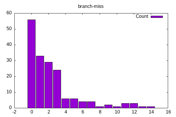
Branch miss rates have a similar distribution as frontend stalls with most having a low miss rate and then a tail of a few benchmarks with higher miss rates.
How branchy is the code as determined by number of retired branches per 1000 instructions.

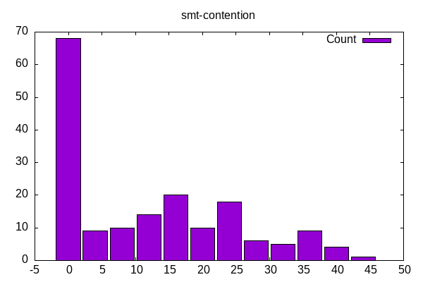
SMT contention is the number of slots going to the “other” core in a hyperthread. The large bar on left reflects both single-threaded workloads and those MPI workloads on physical cores.
There is a similar set of Intel 13500H benchmark plots. I won’t include them here because they reflect similar profiles (fortunately).
Overall, the histograms provide both a nice summary of a population of workloads (phoronix) where it also be interesting to compare/contrast with different workloads such as SPEC. It could also be interesting to aggregate the subset of benchmarks for a specific article. It could also be interesting to dive deeper on the outliers to understand how this affects things and how to best optimize. So many different avenues opened from this…